Straight Talk - Adding Perks to Refill Journeys


Overview
Straight Talk wanted to give customers a flexible way to enhance their phone plan during refill by purchasing optional perks—such as discounted hotspot data, international calling, and roaming—without overwhelming the core plan selection experience.
Our team designed a brand-new perks purchasing flow from scratch, spanning plan selection, an optional perks discovery step, and checkout. The goal was to balance business priorities (upsell and clarity) with usability, scalability, and speed to checkout.
The Problem
Customers refilling their phone plan often want temporary or add-on services—like extra hotspot data or international calling—but Straight Talk had no clear, scalable way to surface these options during checkout.
Key Challenges included:
Avoiding clutter on the Plan Selector page, which already carried strong business priorities
Supporting returning users who may want to re-purchase the same perks month over month
Designing for future scale, where perks could grow from a handful to 40+
Introducing upsell opportunities without increasing checkout friction
Competitive Analysis… including Verizon Postpaid itself
We began by auditing checkout and add-on flows across:
Telecom competitors
E-commerce upsell patterns
Subscription and SaaS add-on experiences
As a team, we annotated examples to identify:
What felt clear vs. overwhelming
How optional steps were communicated
Patterns that encouraged discovery without blocking progress
For Verizon Postpaid, all perks are available for every plan. They are not plan specific. For Straight Talk though, not all perks would be available for all plans. So a 1 page experience would be tricky to design.

For Zoom below, we noticed that the perks are introduced for the first time in the cart. We figured this would not be optimal because internal research suggests users tend to overlook perks here because they may seem solicited and upsells.

Early Exploration (lo-fis): Perks on the Plan Selector
Plan and Perks on 1 page (Steps)
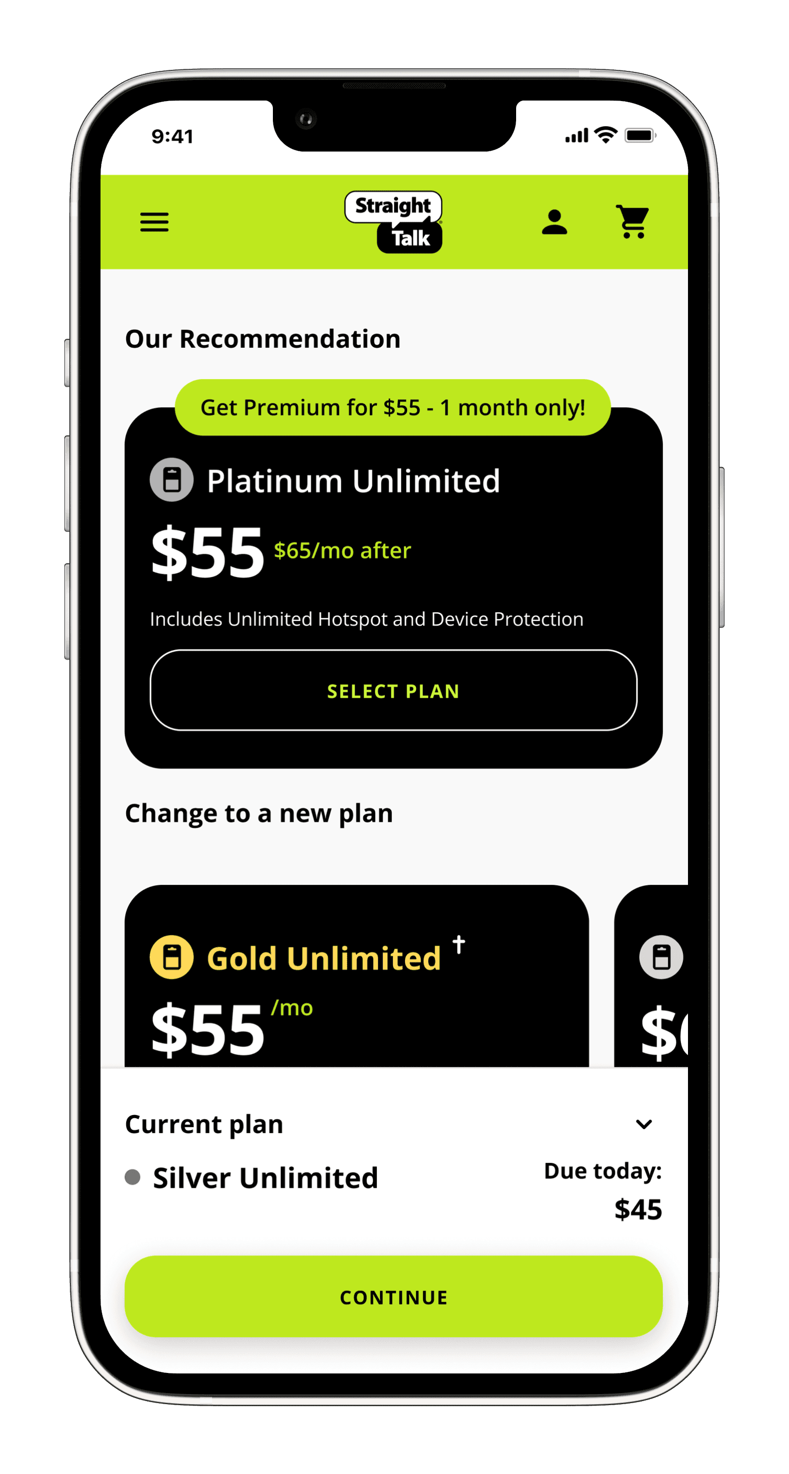
The business team favored showing the perks on the Plan selector page at first because it seemed to perform well on Verizon Postpaid. So to cater to business needs, our initial concept placed perks directly on the Plan Selector page. While this increased visibility, testing and internal feedback revealed several issues:
The page became visually dense and harder to scan
It competed with the recommended plan messaging
It didn’t scale—40 perks would completely break the layout
This approach was ultimately rejected as the Verizon design catered to users who are shopping, not refilling a plan. Our targeted users are returning customers who are refilling their plan via their account manage page. The experience should not feel like a standard shopping/checkout experience.
Solution Part 1: A Smarter Plan Selector
To address scalability and discovery, we introduced a new, optional step in the checkout journey: the Perks Page.
While the business initially worried about adding friction, we designed this step to:
Be clearly labeled as optional
Allow users to skip with a single tap
Feel lightweight and fast, not like a detour
Perks Page Design Decisions
Grid layout showing 4 perks at a time
This reduced analysis paralysis and made options feel approachable.Clear pricing and value upfront
Each perk showed cost and benefit without requiring deep exploration.Future-proofing for scale
We partnered with engineering to plan for pagination and filters once the perk catalog grows.
This approach balanced discoverability with restraint.
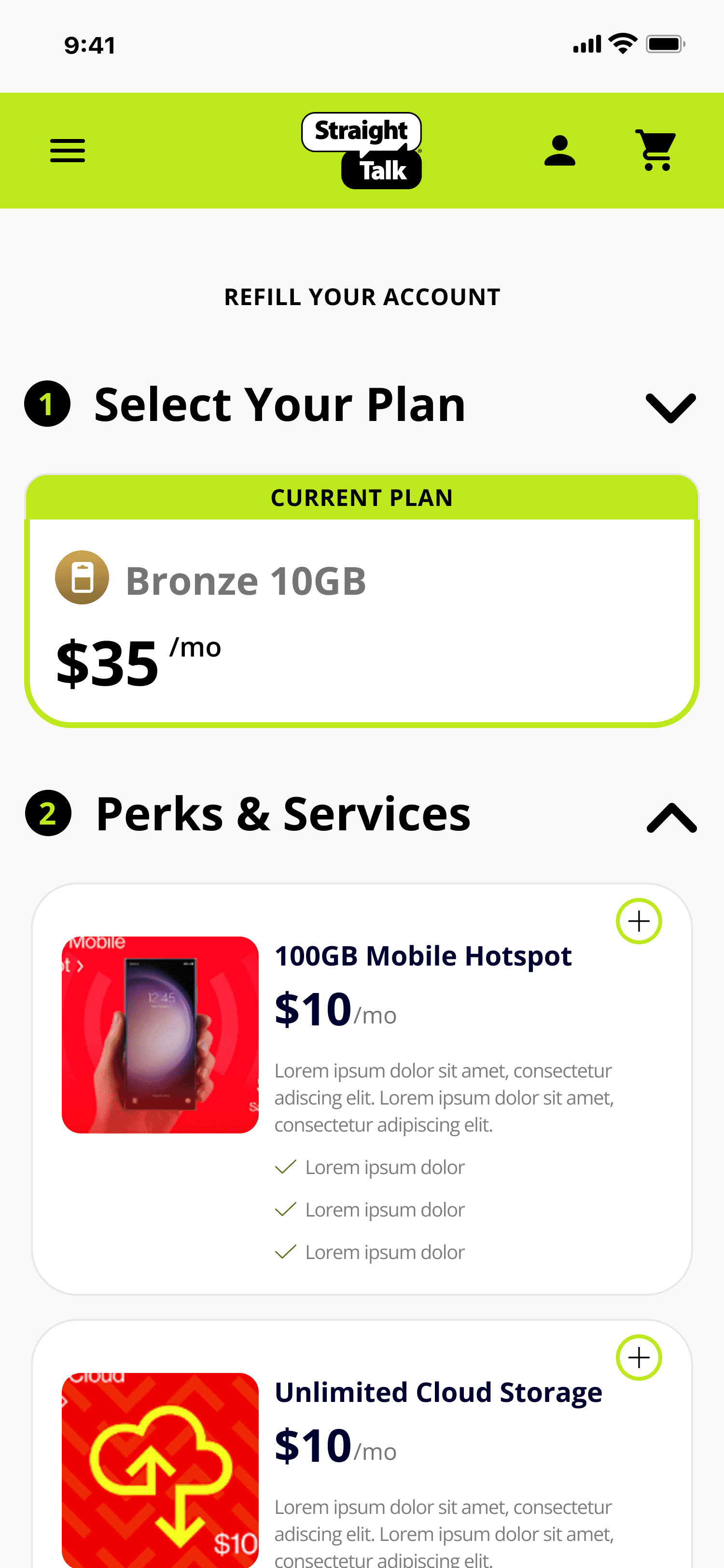
Solution Part 2: A Dedicated Perks Page
To address scalability and discovery, we introduced a new, optional step in the checkout journey: the Perks Page.
While the business initially worried about adding friction, we designed this step to:
Be clearly labeled as optional
Allow users to skip with a single tap
Feel lightweight and fast, not like a detour
Perks Page Design Decisions
Grid layout showing 4 perks at a time
This reduced analysis paralysis and made options feel approachable.Clear pricing and value upfront
Each perk showed cost and benefit without requiring deep exploration.Future-proofing for scale
We partnered with engineering to plan for pagination and filters once the perk catalog grows.
This approach balanced discoverability with restraint.
Solution Part 3: Perks in Cart

Finally, we reinforced control and transparency in the Cart screen.
We added a dedicated Services & Perks section that:
Listed all selected perks alongside the base plan
Allowed users to toggle perks on or off without leaving checkout
Updated the order total in real time
This gave users confidence that nothing was “locked in” and reduced last-minute abandonment caused by price surprises.
Outcomes & Impact
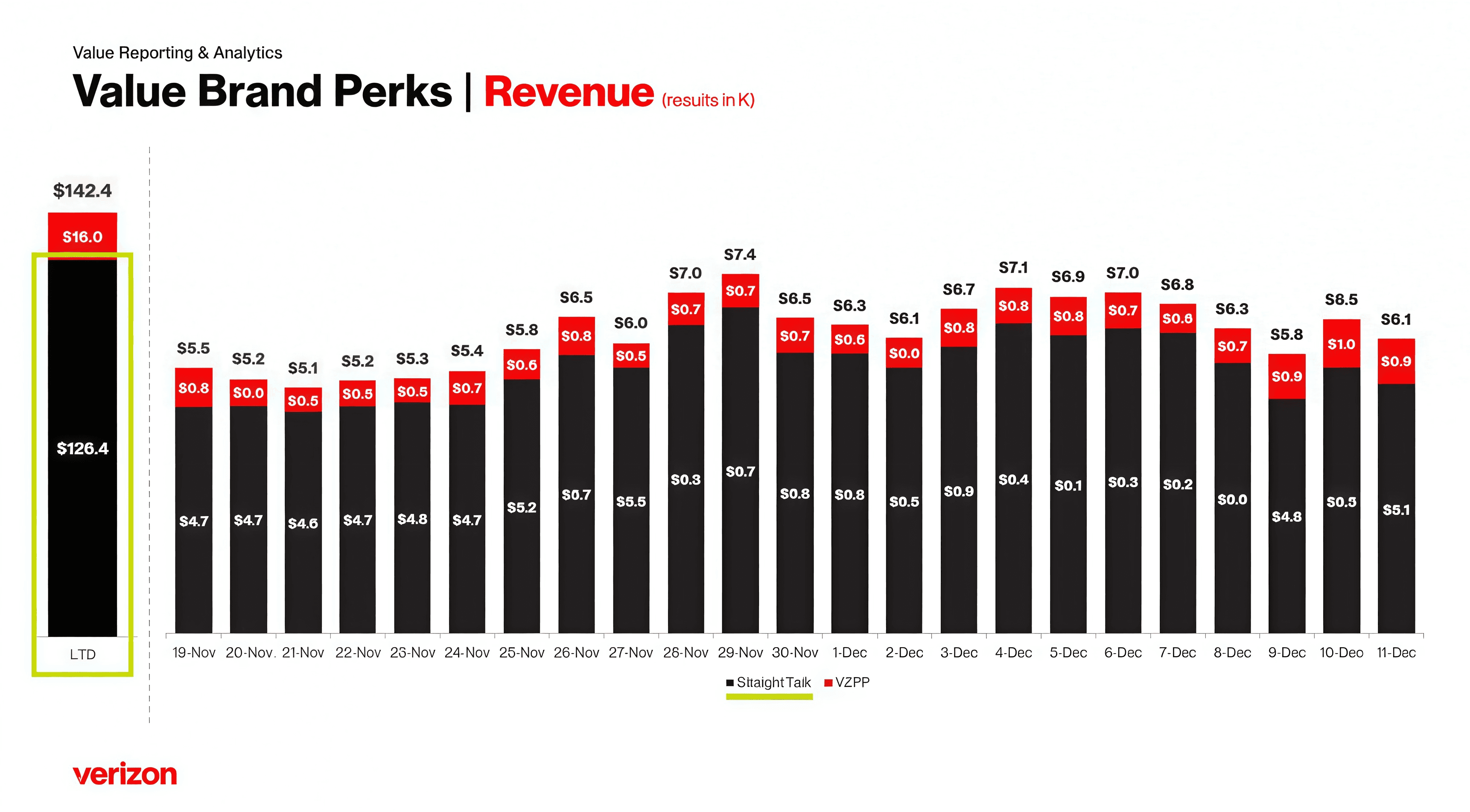
See above for the daily perk purchases from launch to date (LTD). Within the first month of launch, the perks experience drove meaningful business results while maintaining a frictionless checkout flow.
Results (Month 1):
~$130,000 in incremental revenue
~14,000 perks purchased
0 perk cancellations
Mobile Hotspot emerged as the most popular perk
These results validated the decision to introduce perks as an optional, clearly-scoped step rather than forcing them into the plan selection experience.
Business Impact
This experience unlocked a new, scalable revenue stream without compromising the core refill flow.
From a business perspective, it:
Increased average order value without increasing abandonment
Created a foundation for future perk expansion (up to 40+)
Validated upsell as a sustainable strategy for refill moments
From a UX perspective, it demonstrated that:
Upsells don’t have to feel aggressive to be effective.
Thank You For Reading!
🎉
OTHER PROJECTS

Fanatics- 1 Click Checkout

Fanatics- In App Notifications


Straight Talk - Adding Perks to Refill Journeys
Company
Verizon
Role
Senior UX Designer
Result
$140,000 in revenue
Duration
3 Months
Overview
Straight Talk wanted to give customers a flexible way to enhance their phone plan during refill by purchasing optional perks—such as discounted hotspot data, international calling, and roaming—without overwhelming the core plan selection experience.
Our team designed a brand-new perks purchasing flow from scratch, spanning plan selection, an optional perks discovery step, and checkout. The goal was to balance business priorities (upsell and clarity) with usability, scalability, and speed to checkout.
The Problem
Customers refilling their phone plan often want temporary or add-on services—like extra hotspot data or international calling—but Straight Talk had no clear, scalable way to surface these options during checkout.
Key Challenges included:
Avoiding clutter on the Plan Selector page, which already carried strong business priorities
Supporting returning users who may want to re-purchase the same perks month over month
Designing for future scale, where perks could grow from a handful to 40+
Introducing upsell opportunities without increasing checkout friction
Business & UX Constraints
The Plan Selector page had strict requirements from the business:
A recommended plan (usually the next higher tier) must be prominently featured at the top
All other available plans needed to remain visible within the viewport
The user’s current plan had to remain clear, especially for refills
Early explorations showed that adding perks directly to this page created visual overload and cognitive friction—especially as the number of perks increased.
This forced us to rethink where and how perks should live in the journey.
Competitive Analysis… including Verizon Postpaid itself
We began by auditing checkout and add-on flows across:
Telecom competitors
E-commerce upsell patterns
Subscription and SaaS add-on experiences
As a team, we annotated examples to identify:
What felt clear vs. overwhelming
How optional steps were communicated
Patterns that encouraged discovery without blocking progress
For Verizon Postpaid, all perks are available for every plan. They are not plan specific. For Straight Talk though, not all perks would be available for all plans. So a 1 page experience would be tricky to design.
For Zoom below, we noticed that the perks are introduced for the first time in the cart. We figured this would not be optimal because internal research suggests users tend to overlook perks here because they may seem solicited and upsells.
Early Exploration (lo-fis): Perks on the Plan Selector

The business team favored showing the perks on the Plan selector page at first because it seemed to perform well on Verizon Postpaid. So to cater to business needs, our initial concept placed perks directly on the Plan Selector page. While this increased visibility, testing and internal feedback revealed several issues:
The page became visually dense and harder to scan
It competed with the recommended plan messaging
It didn’t scale—40 perks would completely break the layout
This approach was ultimately rejected as the Verizon design catered to users who are shopping, not refilling a plan. Our targeted users are returning customers who are refilling their plan via their account manage page. The experience should not feel like a standard shopping/checkout experience.
Solution Part 1: A Smarter Plan Selector
To preserve clarity, we focused the Plan Selector on its primary job: choosing a plan.
We introduced a sticky summary module at the bottom of the screen that:
Clearly displayed the currently selected plan
Persisted as users scrolled through plan options
Could be expanded to show pricing details and previously selected perks
This solved several problems at once:
Business requirement is fulfilled because we are able to show the Current Plan and Recommend Plan above the fold.
Returning users could quickly confirm what they had last month
Pricing transparency reduced uncertainty
Solution Part 2: A Dedicated Perks Page


To address scalability and discovery, we introduced a new, optional step in the checkout journey: the Perks Page.
While the business initially worried about adding friction, we designed this step to:
Be clearly labeled as optional
Allow users to skip with a single tap
Feel lightweight and fast, not like a detour
Perks Page Design Decisions
Grid layout showing 4 perks at a time
This reduced analysis paralysis and made options feel approachable.Clear pricing and value upfront
Each perk showed cost and benefit without requiring deep exploration.Future-proofing for scale
We partnered with engineering to plan for pagination and filters once the perk catalog grows.
This approach balanced discoverability with restraint.
Solution Part 3: Perks in Cart
Finally, we reinforced control and transparency in the Cart screen.
We added a dedicated Services & Perks section that:
Listed all selected perks alongside the base plan
Allowed users to toggle perks on or off without leaving checkout
Updated the order total in real time
This gave users confidence that nothing was “locked in” and reduced last-minute abandonment caused by price surprises.
Outcomes & Impact
See above for the daily perk purchases from launch to date (LTD). Within the first month of launch, the perks experience drove meaningful business results while maintaining a frictionless checkout flow.
Results (Month 1):
~$130,000 in incremental revenue
~14,000 perks purchased
0 perk cancellations
Mobile Hotspot emerged as the most popular perk
These results validated the decision to introduce perks as an optional, clearly-scoped step rather than forcing them into the plan selection experience.
Business Impact
This experience unlocked a new, scalable revenue stream without compromising the core refill flow.
From a business perspective, it:
Increased average order value without increasing abandonment
Created a foundation for future perk expansion (up to 40+)
Validated upsell as a sustainable strategy for refill moments
From a UX perspective, it demonstrated that:
Upsells don’t have to feel aggressive to be effective.
Thank You For Reading!
🎉
OTHER PROJECTS
Fanatics- In-App Notifications