Fanatics- 1 Click Checkout
A more convenient and faster way to purchase trending digital trading cards.
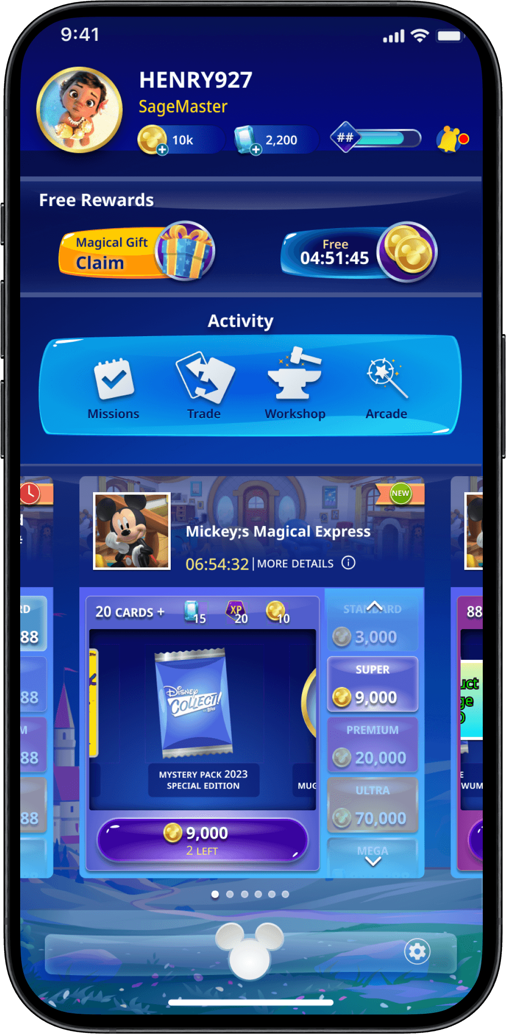
The Problem: Special Card Packs Go Unnoticed
The Topps Disney Digital Collectibles app allows fans to browse, purchase, and trade digital Disney card packs. However, because of the sheer amount of content in the app, special deals and trending cards go unnoticed.
The business objective was challenging: design a carousel experience directly on the home-screen so users can quickly browse through tending digital card packs and make a purchase in 1 click.
UX Research: Where will the Direct Purchase Module (DPM) be placed on the home-screen?
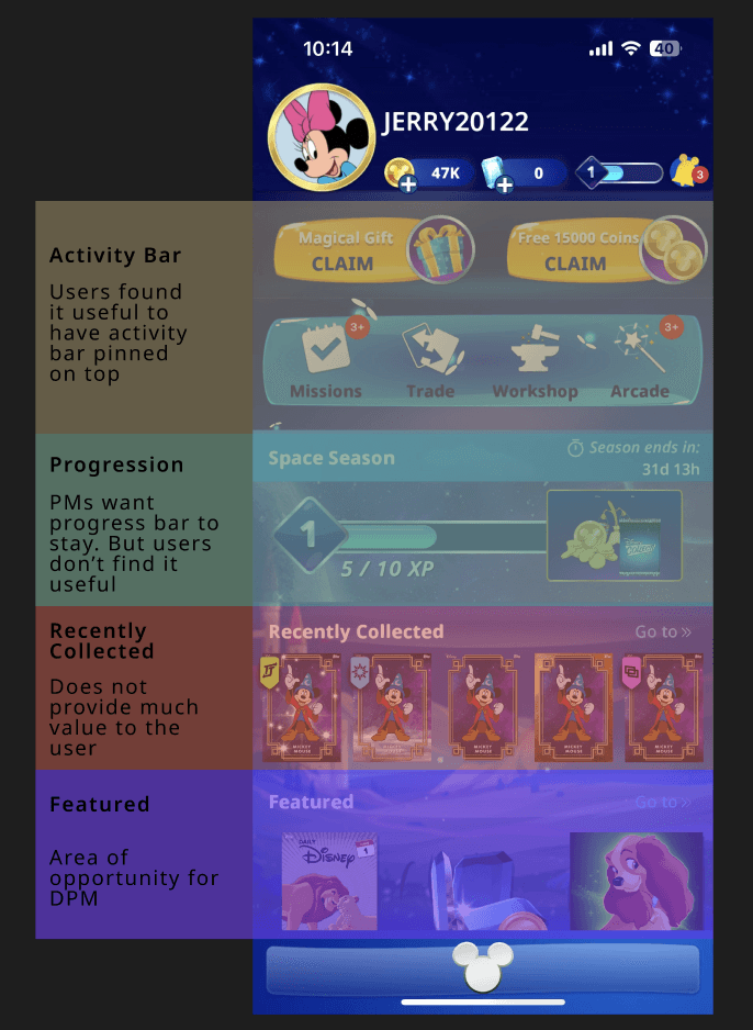
The project kicked off with UX Research. The Product Managers asked me to discover user habits and opinions on the home-screen so we can collectively decide where to implement the module. I interviewed 10 existing users and ranked each module based on level of importance and utilization.
Ranking each section on the Home screen based on importance and usage.
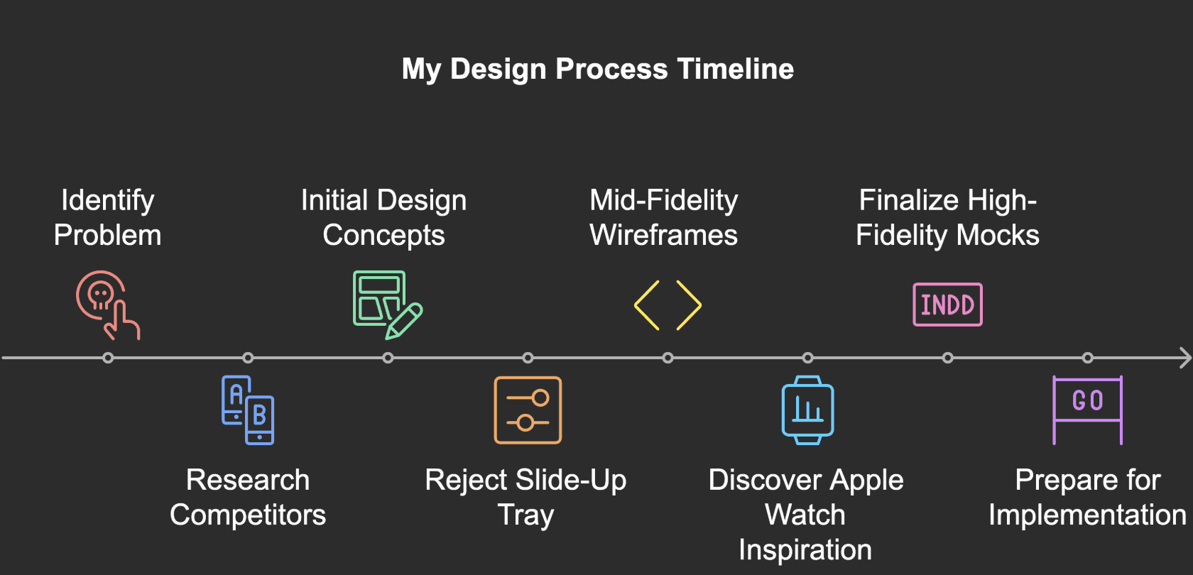
Early Exploration: Slide-Up Tray Concept (Rejected)
Our first concept involved a familiar slide-up tray triggered when users tapped on a product. It provided detailed product information while keeping users anchored to the home screen. While initially promising, we rejected this design. Despite being visually clean, it failed our core objective: it still required multiple taps to finalize a purchase.
The research suggest that the Recently Collected module is the less used feature on the app. Therefore, the PM and Developers agreed to remove it and push the Progression Bar below the new DPM. Since the DPM can bring more value and revenue to the company, it was prioritized over the recently implemented Progression Bar. I was able to successfully balance the needs of the business and users.
The slide up tray adds more clicks and more steps for the user. The Product team had made it clear that a purchase should take 1 click.
Horizontal Scroll Module (Partially Approved) Customer Journey
Next, I explored a horizontal scroll module that expanded product information inline, using data visualization and concise layout design. The idea was to reduce information density while enabling interaction directly on the home screen.

Horizontal infinite scroll was a good concept. However, the Business team challenged me and my team to explore other options.
While this version reduced friction, it introduced a new usability issue: too many scroll hotspots. Users could unintentionally "fat thumb" the carousel, leading to a poor experience. Due to tight timelines, this design was conditionally approved while we searched for a better scrolling mechanism.
Breakthrough Inspiration: Apple Watch
Facing a one-week deadline, I found unexpected inspiration from my Apple Watch. The watch's vertical scroll gauge on the right side offered an intuitive way to view layered content without clutter.
This sparked a new idea: What if we rotated the information vertically—rather than horizontally—and paired it with a slim scroll gauge for context?
The rotating gauge on the right side inspired my team and I to design new wireframes- which were approved (see below)
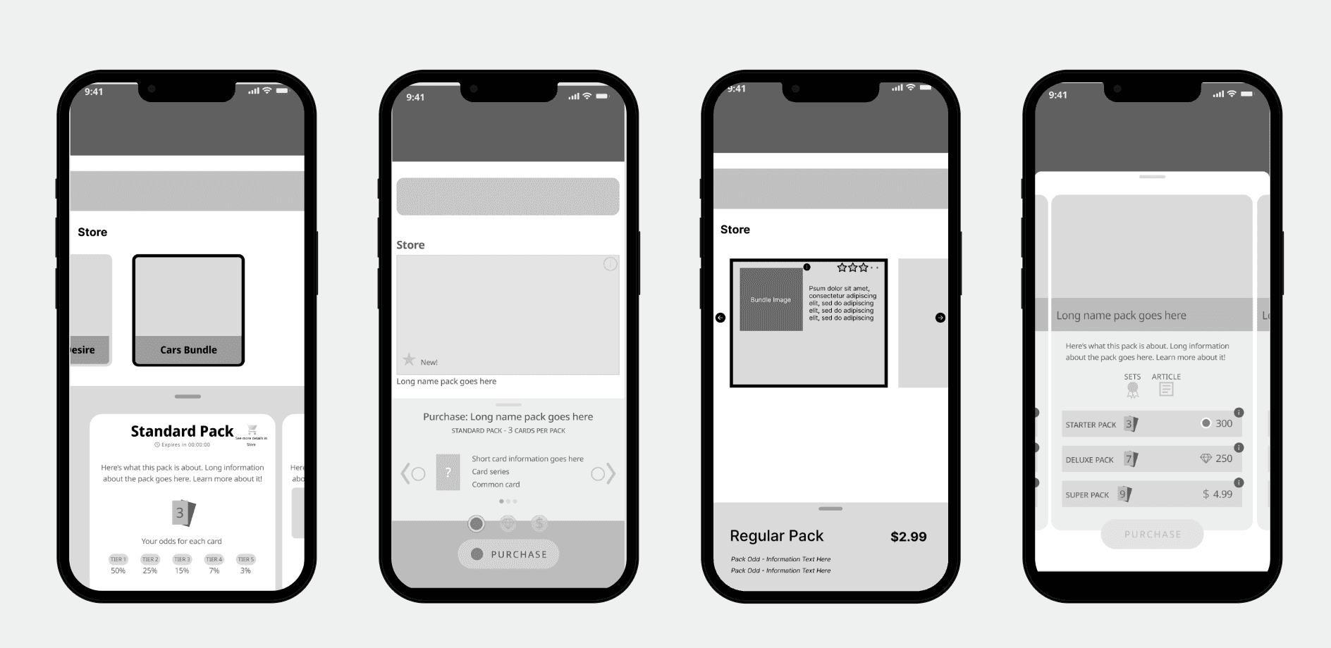
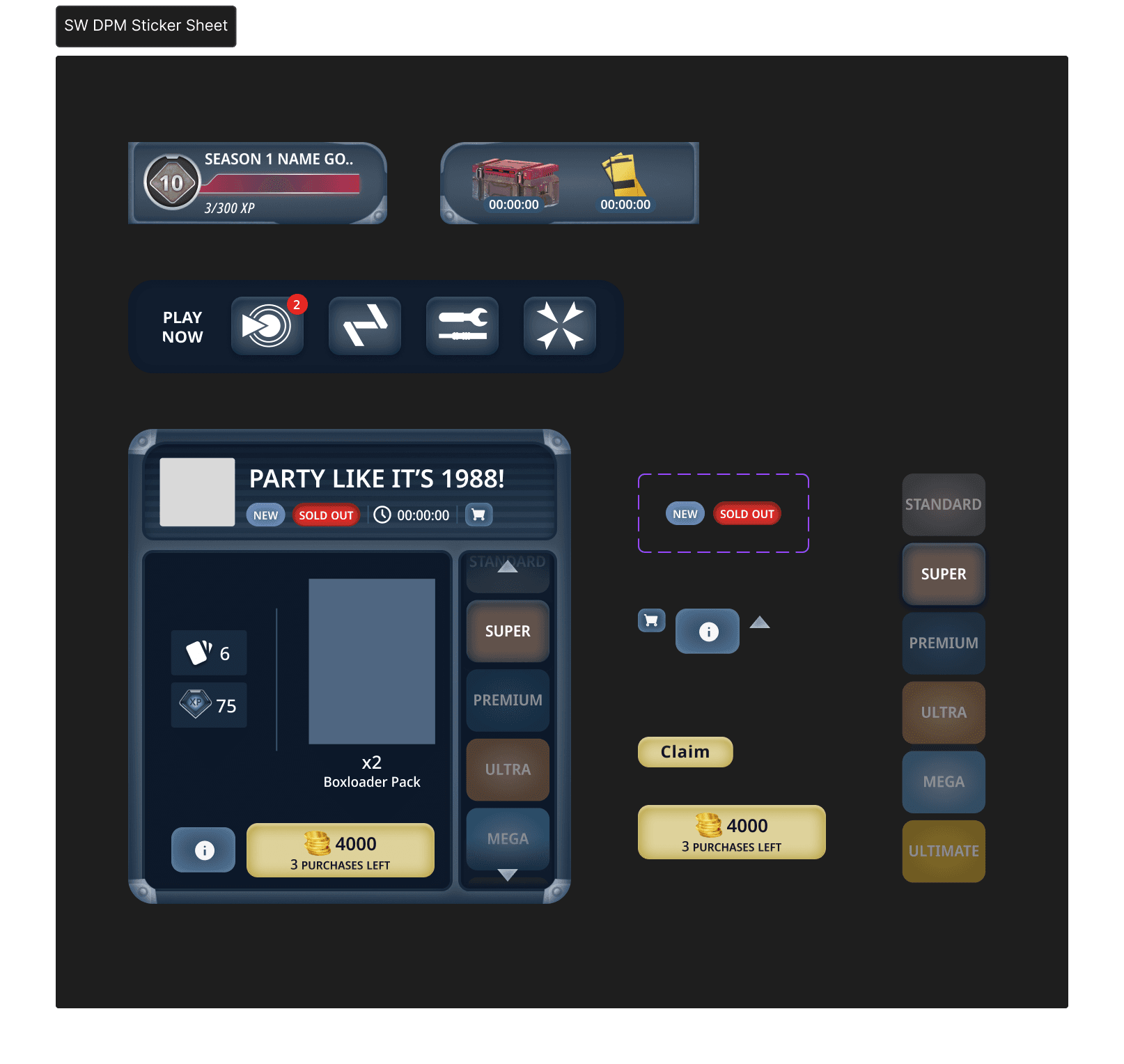
Mid Fidelity Wireframes (Approved)
With this new direction, I redesigned the module to present product info—pack types, odds, and pricing—in a vertical carousel positioned on the right side of each card pack. It allowed users to digest key information at a glance, directly from the home screen, with just one interaction.

An example of all of the possible paths the app can route the user depending on their SSN status and overall risk profile.
UI Phase- Reusing Existing Assets
I finalized the mid-fidelity wireframes, refining spacing, hit zones, and visual hierarchy before handing off to our UI designer. Together, we applied the Disney design system to create high-fidelity mocks.

Reskinning for BUNT and Star Wars Collect
This screen clearly informs the user the sAfter delivery for the Disney Collect app, my team and I were tasked to provide mockups for the IPs such as BUNT and Star Wars Collect.
I worked with our UI Developer Team to design and deliver components that made up the DPM for BUNT Collect.

Delivery- 1 Click Experience
At the end of the 4 weeks I delivered High Fidelity Wireframes of the DPM. The DPM achieves the business objective- to bring more visibility to trending/ on sale card packs and allow users to purchase them via 1 click. I was able to successfully manage and balance the demands of the users, Product Managers, and developers.

Thank You For Reading!
🎉
OTHER PROJECTS
Fanatics- In App Notifications
RockWallet- KYC Improvements


Fanatics- 1 Click Checkout
A more convenient and faster way to purchase trending digital trading cards.
Company
Fanatics/ Topps
Role
Senior UX Designer
Result
Successful Delivery
Duration
3 Weeks
The Problem: Special Card Packs Go Unnoticed
The Topps Disney Digital Collectibles app allows fans to browse, purchase, and trade digital Disney card packs. However, because of the sheer amount of content in the app, special deals and trending cards go unnoticed.
Achieving the Business Objective in a short time
The goal was challenging: design a carousel experience directly on the home-screen so users can quickly browse through tending digital card packs and make a purchase in 1 click.
My team and I had exactly 4 weeks to research and design the 1 Click Purchase Module (DPM) as developer timelines were condensed due to resolving ongoing bug fixes.
UX Research: Where will the Direct Purchase Module (DPM) be placed on the home-screen?
The project kicked off with UX Research. The Product Managers asked me to discover user habits and opinions on the home-screen so we can collectively decide where to implement the module. I interviewed 10 existing users and ranked each module based on level of importance and utilization.
Ranking each section on the Home screen based on importance and usasge.
The research suggest that the Recently Collected module is the less used feature on the app. Therefore, the PM and Developers agreed to remove it and push the Progression Bar below the new DPM. Since the DPM can bring more value and revenue to the company, it was prioritized over the recently implemented Progression Bar. I was able to successfully balance the needs of the business and users.
Early Exploration: Slide-Up Tray Concept (Rejected)
Our first concept involved a familiar slide-up tray triggered when users tapped on a product. It provided detailed product information while keeping users anchored to the home screen. While initially promising, we rejected this design. Despite being visually clean, it failed our core objective: it still required multiple taps to finalize a purchase.
The slide up tray adds more clicks and more steps for the user. The Product team had made it clear that a purchase should take 1 click.
Design question: How might we surface enough product information on the home screen—without overwhelming the user or adding extra taps?
Horizontal Scroll Module (Partially Approved) Customer Journey
Next, I explored a horizontal scroll module that expanded product information inline, using data visualization and concise layout design. The idea was to reduce information density while enabling interaction directly on the home screen.
Horizontal infinite scroll was a good concept. However, the Business team challenged me and my team to explore other options.
While this version reduced friction, it introduced a new usability issue: too many scroll hotspots. Users could unintentionally "fat thumb" the carousel, leading to a poor experience. Due to tight timelines, this design was conditionally approved while we searched for a better scrolling mechanism.
Breakthrough Inspiration: Apple Watch
Facing a one-week deadline, I found unexpected inspiration from my Apple Watch. The watch's vertical scroll gauge on the right side offered an intuitive way to view layered content without clutter.
This sparked a new idea: What if we rotated the information vertically—rather than horizontally—and paired it with a slim scroll gauge for context?
The rotating gauge on the right side inspired my team and I to design new wireframes- which were approved (see below)
Mid Fidelity Wireframes (Approved)
With this new direction, I redesigned the module to present product info—pack types, odds, and pricing—in a vertical carousel positioned on the right side of each card pack. It allowed users to digest key information at a glance, directly from the home screen, with just one interaction.
An example of all of the possible paths the app can route the user depending on their SSN status and overall risk profile.
I finalized the mid-fidelity wireframes, refining spacing, hit zones, and visual hierarchy before handing off to our UI designer. Together, we applied the Disney design system to create high-fidelity mocks.
UI Phase- Reusing Existing Assets
I finalized the mid-fidelity wireframes, refining spacing, hit zones, and visual hierarchy before handing off to our UI designer. Together, we applied the Disney design system to create high-fidelity mocks.
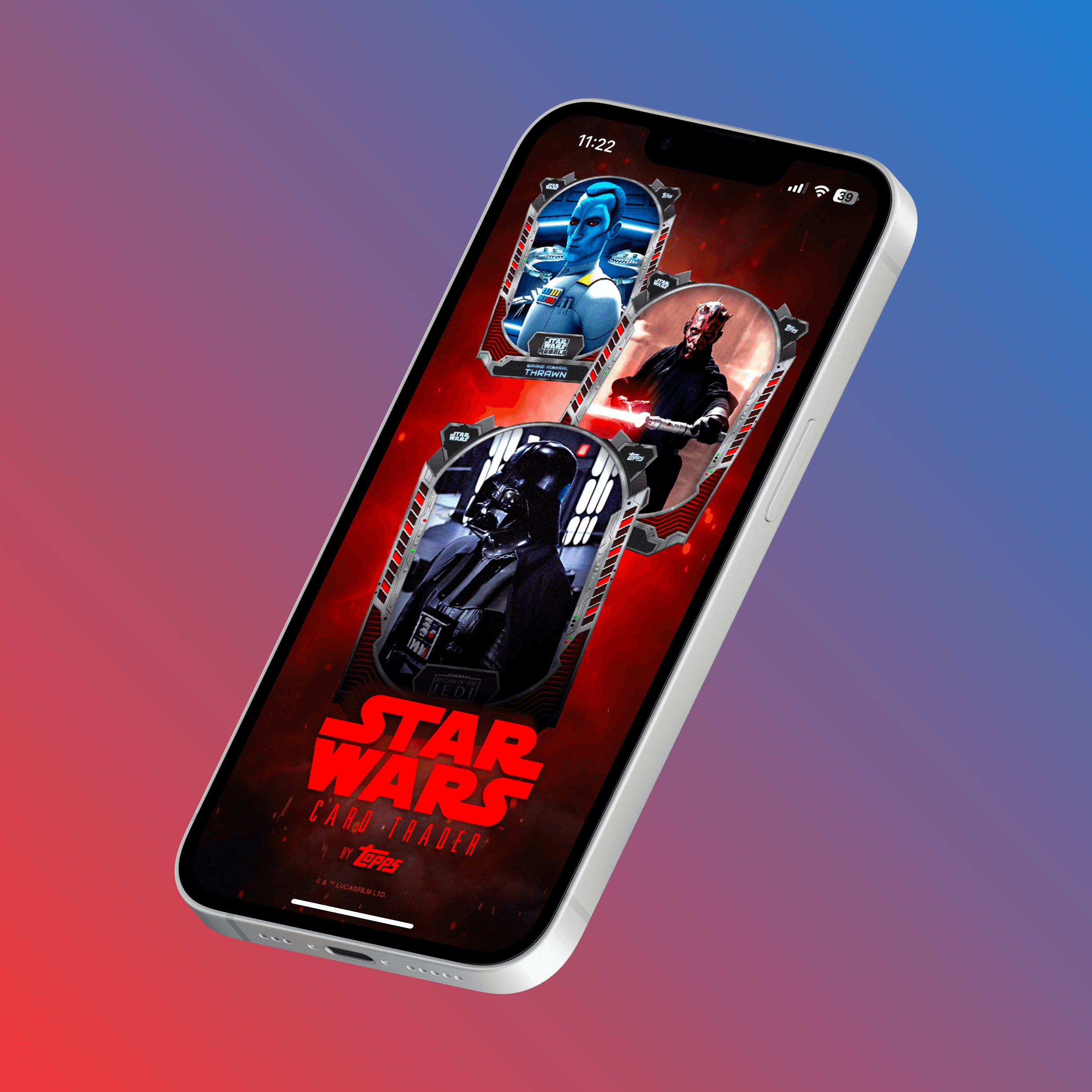
Reskinning for BUNT and Star Wars Collect
After delivery for the Disney Collect app, my team and I were tasked to provide mockups for the IPs such as BUNT and Star Wars Collect.
I worked with our UI Developer Team to design and deliver components that made up the DPM for BUNT Collect.
Delivery- 1 Click Experience
At the end of the 4 weeks I delivered High Fidelity Wireframes of the DPM. The DPM achieves the business objective- to bring more visibility to trending/ on sale card packs and allow users to purchase them via 1 click. I was able to successfully manage and balance the demands of the users, Product Managers, and developers.

Thank You For Reading!
🎉
OTHER PROJECTS
Fanatics- In App Notifications