Fanatics- In App Notifications
Increasing engagement via In-App notifications
The Problem: Too many unclaimed rewards
The Star Wars and Disney Digital Collectibles app is filled with fun and collectible content, but users often miss out on rewards they’ve earned.
📊 64% of users admitted they often forget to claim their rewards due to a lack of reminders.
Goal: Design a non-Intrusive in-app messaging system
The product management tasked my team and I to design the app's in-app messages to:
Increase engagement
Maintain a delightful experience without feeling spammy
Remind users about claimable rewards

Most users forget to claim their rewards because they simply forget they exist.
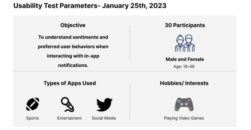
Research: Understanding User Sentiment
My team and I began the research sprint by setting up a 12-question usability test that is designed to understand user sentiment toward notifications.The results will help us design a few prototypes that align with the user preferences.
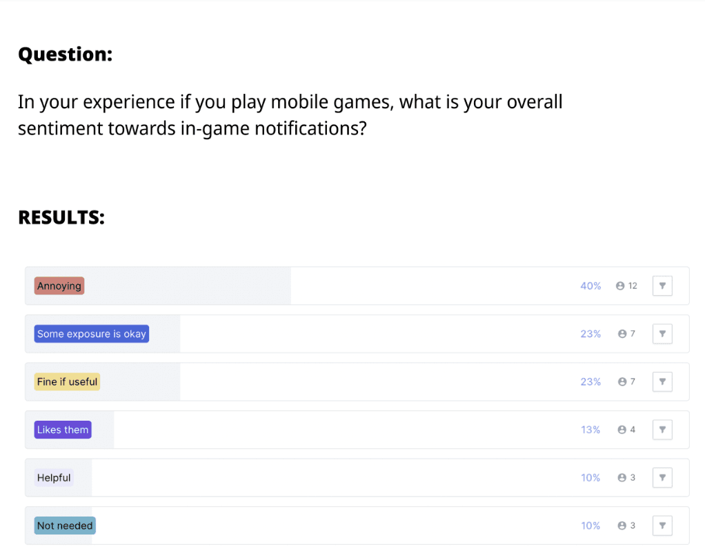
The user surveys revealed that users want relevant, non-repetitive, and timely notifications — not alerts for everything. See below for some results.
Users generally have a negative sentiment for notifications
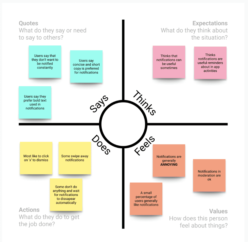
Overall user sentiment summarized in an Empathy Map
Users generally have a negative sentiment for notifications
Overall user sentiment summarized in an Empathy Map
Users generally have a negative sentiment for notifications
Overall user sentiment summarized in an Empathy Map
Users generally have a negative sentiment for notifications
Overall user sentiment summarized in an Empathy Map
Competitive Analysis
Now that my team and I understood that users generally prefer non-invasive and meaningful in-app notifications, my team and I analyzed other apps that utilize push notifications strategically.

Most toaster messages appear for a short time and then are either manually or automatically dismissed.
While this version reduced friction, it introduced a new usability issue: too many scroll hotspots. Users could unintentionally "fat thumb" the carousel, leading to a poor experience. Due to tight timelines, this design was conditionally approved while we searched for a better scrolling mechanism.
Design question: How might we not overwhelm the user with toaster messages but still inform them about unclaimed rewards?
Low Fidelity Designs & Usability Testing
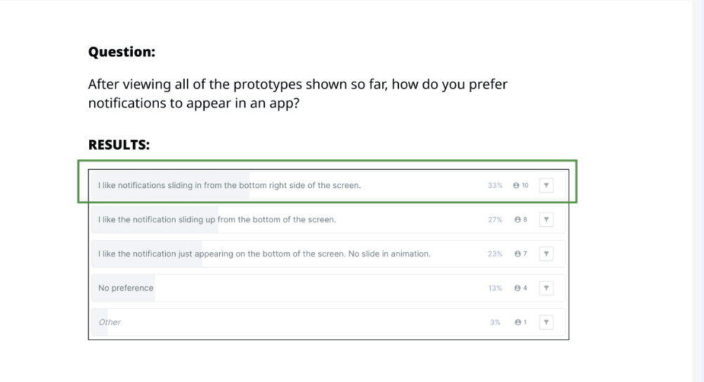
Based on our user research and competitive analysis, I designed 3 viable toaster message triggers and asked 30 users to pick which design is more favorable.
Option 1: Slide up from bottom and click on x to dismiss
Option 2: Slide up from bottom and
auto dismiss
Option 3: Appear at bottom then click on x to dismiss
Option 1: Slide up from bottom and click on x to dismiss
Option 2: Slide up from bottom and
auto dismiss
Option 3: Appear at bottom then click on x to dismiss
Option 1: Slide up from bottom and click on x to dismiss
Option 2: Slide up from bottom and
auto dismiss
Option 3: Appear at bottom then click on x to dismiss
Option 1: Slide up from bottom and click on x to dismiss
Option 2: Slide up from bottom and
auto dismiss
Option 3: Appear at bottom then click on x to dismiss
Option 2 Wins: Slide in from right then auto dismiss
Didn't block content or require action
Felt modern and lightweight
Users liked that it disappeared automatically
2nd Usability Test: Testing and confirming preferred Dismissal Control
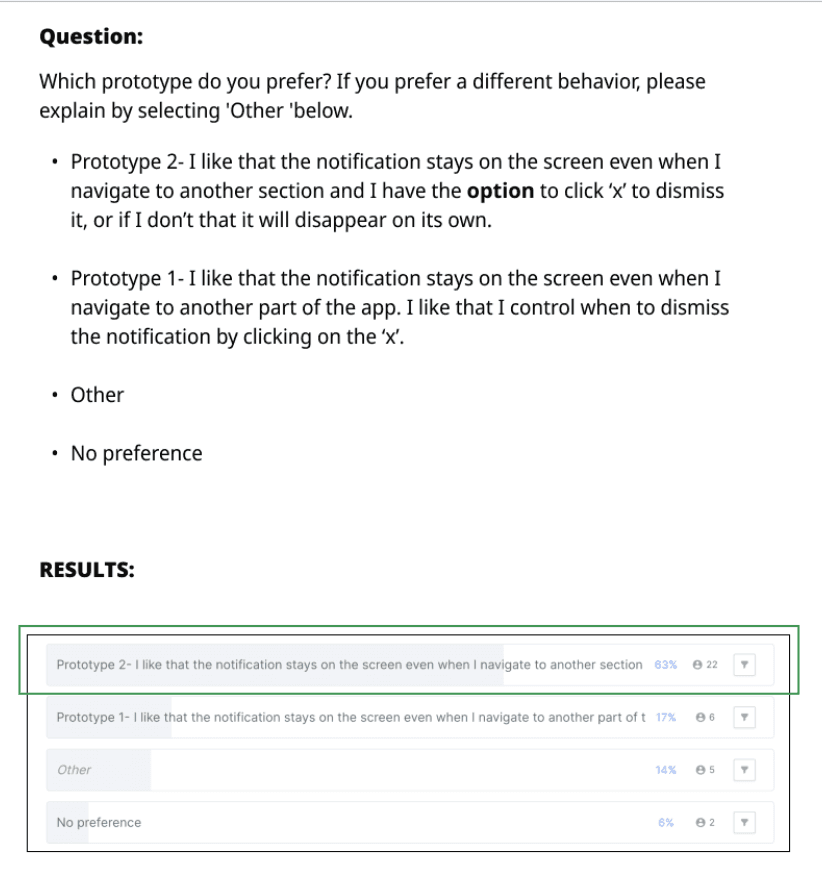
We confirmed the slide in behavior but the results did not reveal a clear winner for the preferred dismissal behavior. So, I designed 2 more options to test the preferred dismissal behavior.
Option 1: Travels with you and
manual dismiss
Option 2: Travels with you and
auto fades away
Option 1: Travels with you and
manual dismiss
Option 2: Travels with you and
auto fades away
Option 1: Travels with you and
manual dismiss
Option 2: Travels with you and
auto fades away
Option 1: Travels with you and
manual dismiss
Option 2: Travels with you and
auto fades away
Using Chat GPT for UI inspiration
The use of Artificial Intelligence (A.I) has become widely known in 2023 so I figured to use it to get a few initial ideas for the color palette. Since the notification system will be launched in the Star Wars app first, I asked ChatGPT to give a few colors that complement the app's dark blue background color (hex # 182839).The results were pretty interesting!
After some market research and brand identification exercises, I decided to incorporate the iconic holographic effect from Star Wars into my design.

I finalized the mid-fidelity wireframes, refining spacing, hit zones, and visual hierarchy before handing off to our UI designer. Together, we applied the Disney design system to create high-fidelity mocks.
High-Fidelity Mock
My team and I were able to successfully deliver the guidelines below and High-Fidelity mocks to the Product Manager. This was a very complex project as there was a lot of collaboration with developers. Overall my team and I prevailed and designed a notification system that will be utilized for all types of in-app notifications in the future.
Thank You For Reading!
🎉
OTHER PROJECTS
RockWallet- KYC Improvements

Fanatics- 1 Click Checkout


Fanatics- In App Notifications
Increasing engagement via In-app notifications
Company
Fanatics/ Topps
Role
Senior UX Designer
Result
Successful Delivery
Duration
2 Months
The Problem: Too many unclaimed rewards
The Star Wars and Disney Digital Collectibles app is filled with fun and collectible content, but users often miss out on rewards they’ve earned.
📊 64% of users admitted they often forget to claim their rewards due to a lack of reminders.
Most users forget to claim their rewards because they simply forget they exist.
Goal: Design a non-Intrusive in-app messaging system
The product management tasked my team and I to design the app's in-app messages to:
Increase engagement
Maintain a delightful experience without feeling spammy
Remind users about claimable rewards
Research: Understanding User Sentiment
My team and I began the research sprint by setting up a 12-question usability test that is designed to understand user sentiment toward notifications.The results will help us design a few prototypes that align with the user preferences.
The user surveys revealed that users want relevant, non-repetitive, and timely notifications — not alerts for everything. See below for some results.
Users generally have a negative sentiment for notifications
Overall user sentiment summarized in an Empathy Map
Users generally have a negative sentiment for notifications
Overall user sentiment summarized in an Empathy Map
Users generally have a negative sentiment for notifications
Overall user sentiment summarized in an Empathy Map
Users generally have a negative sentiment for notifications
Overall user sentiment summarized in an Empathy Map
Competitive Analysis
Now that my team and I understood that users generally prefer non-invasive and meaningful in-app notifications, my team and I analyzed other apps that utilize push notifications strategically.

Most toaster messages appear for a short time and then are either manually or automatically dismissed.
Design question: How might we not overwhelm the user with toaster messages but still inform them about unclaimed rewards?
Low Fidelity Designs & Usability Testing
Based on our user research and competitive analysis, I designed 3 viable toaster message triggers and asked 30 users to pick which design is more favorable.
Option 1: Slide up from bottom and click on x to dismiss
Option 2: Slide up from bottom and auto dismiss
Option 3: Appear at bottom then click on x to dismiss
Option 1: Slide up from bottom and click on x to dismiss
Option 2: Slide up from bottom and auto dismiss
Option 3: Appear at bottom then click on x to dismiss
Option 1: Slide up from bottom and click on x to dismiss
Option 2: Slide up from bottom and auto dismiss
Option 3: Appear at bottom then click on x to dismiss
Option 1: Slide up from bottom and click on x to dismiss
Option 2: Slide up from bottom and auto dismiss
Option 3: Appear at bottom then click on x to dismiss
Option 2 Wins: Slide in from right then auto dismiss
Didn't block content or require action
Felt modern and lightweight
Users liked that it disappeared automatically
2nd Usability Test: Testing and confirming preferred Dismissal Control
We confirmed the slide in behavior but the results did not reveal a clear winner for the preferred dismissal behavior. So, I designed 2 more options to test the preferred dismissal behavior.
Option 1: Travels with you and manual dismiss
Option 2: Travels with you and auto fades away
Option 1: Travels with you and manual dismiss
Option 2: Travels with you and auto fades away
Option 1: Travels with you and manual dismiss
Option 2: Travels with you and auto fades away
Option 1: Travels with you and manual dismiss
Option 2: Travels with you and auto fades away
Option 2 Wins! Alert travels with Auto Dismiss Option
Users want to manually dismiss, but also appreciate when notifications disappear on their own. A hybrid approach was also ideal for development constraints.
Using Chat GPT for UI inspiration
The use of Artificial Intelligence (A.I) has become widely known in 2023 so I figured to use it to get a few initial ideas for the color palette. Since the notification system will be launched in the Star Wars app first, I asked ChatGPT to give a few colors that complement the app's dark blue background color (hex # 182839).The results were pretty interesting!
After some market research and brand identification exercises, I decided to incorporate the iconic holographic effect from Star Wars into my design.
I finalized the mid-fidelity wireframes, refining spacing, hit zones, and visual hierarchy before handing off to our UI designer. Together, we applied the Disney design system to create high-fidelity mocks.
High-Fidelity Mock
My team and I were able to successfully deliver the guidelines below and High-Fidelity mocks to the Product Manager. This was a very complex project as there was a lot of collaboration with developers. Overall my team and I prevailed and designed a notification system that will be utilized for all types of in-app notifications in the future.
Guidelines:
All notifications will auto-fade away after 3 seconds.
All notifications can also be manually dismissed by clicking ‘x’
All notifications will slide up from the bottom
The next notifications will appear in place of the former one when the former one is dismissed/auto fades away- no stacking
Clickable/ Claimable notifications will glow green and have an icon
Non/Clickable notifications will be a standard color and will not have an icon
Thank You For Reading!
🎉
OTHER PROJECTS
OTHER PROJECTS
RockWallet - KYC Improvements
